OBJECTIVES
- Design a crisp, clean, and visual presentation that enables you to maintain control of the meeting and the message.
- Allow the client to stay focused on you and your story rather than what is on the page you are sharing.
CHALLENGES
- Most presentations are dense, chock-full of words and numbers, heavily product-centric, tedious to decipher, and generally uninspiring.
- People cannot read and listen to you at the same time. When confronted with deciphering a new page or listening to you, they will default to reading, not retaining anything you are saying.
- Clients are quick to notice and get distracted by inconsistencies in your design, like the use of color, fonts, and images. When they are distracted by your design, they are not paying attention to you or your content.
- People are six times more likely to remember a picture than what they read or hear.
- You cannot take what you build for paper and expect it to project well up onto the wall. Presentations that display beautifully on your monitor or print well are often not audience-friendly when projected.
- Your presentation deck cannot also serve as a leave-behind for people who could not attend the meeting. It is either one or the other; it cannot successfully serve two purposes.
- There is not much you can fit onto any single slide, and that is the point, you are not supposed to.
TECHNIQUES
Your presentation deck is a tool to support your story during the live meeting. When designed well, it punctuates the verbal messages you are delivering. In order for your deck to work to your advantage, it is critical that you move away from content- heavy slides. Instead, simplify your message, reduce the amount of text, open up the slide by including only the most critical information, and go BIG with fonts and pictures to help get your message across.
Follow these design tips to make your presentation look great and keep your client engaged:
A. Fewer words, fewer bullets
Each slide should display only the most essential information; you deliver the rest in what you say.
1. Use clear and simple language.
2. Apply the 6x6 rule that says no more than 6 bullets to a page, each bullet no more than 6 words.
3. Start bullets with action words and avoid complete sentences.
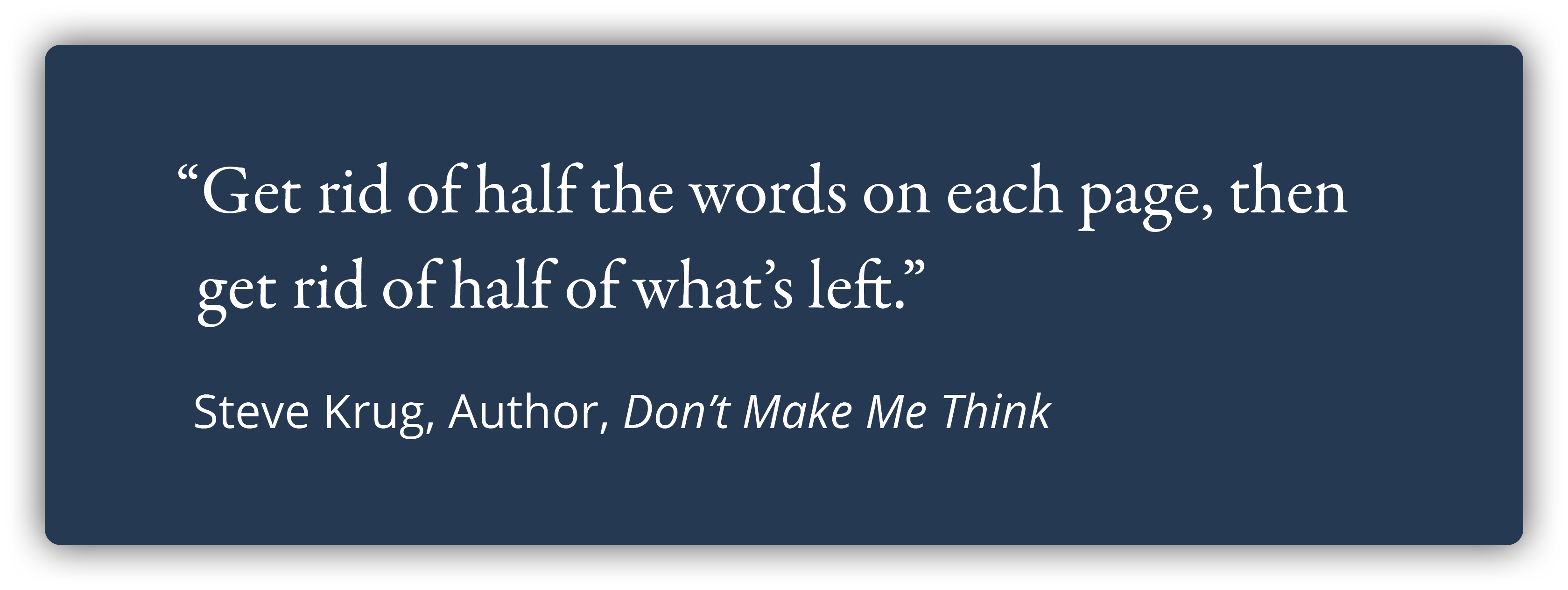
Get rid of half the words on each page, then get rid of half of what’s left.
Steve Krug, Author, Don't Make Me Think
B. More visuals
1. Our brains prefer visuals over text.
Your client will be more likely to look at your slide if you have a good visual.
Great visuals level up the meeting experience because they make your client think. When they are thinking they are engaged. Great visuals even have the power to inspire!
Studies show that the combination of a great visual with limited text significantly increases the likelihood of information making it to the client's long-term memory.
2. If you feel like you need to say, “I know you can’t read this…” or "This slide is busy...", then it is time to rethink your visuals or the entire slide.
3. Larger images can have more impact. Make sure the resolution is sharp so the images are not blurry or pixelated.
C. Visibility
You want every person in the room to be able to read your slides just as well as the person sitting right in front of you.
1. Select a sans-serif font such as Arial or Helvetica because these are easy to read.
2. The font size should be no less than 30 points.
3. To test what your audience will see, go to “presentation mode” and view your slides at 66%. If fonts, images, graphs, or charts are straining your eyes on the screen, then they will be difficult for your clients to see during the meeting.
4. Redesign each page as needed.

D. One key message per slide
You want your client focused on your key point. Having multiple messages, charts, graphs, or boxes causes distraction as the client’s brain tries to make sense of it all. While they are trying to figure it all out, they are not listening to you.
1. Use graphics, color, text size and weight to draw their eye to your main point.
2. Apply the ‘Billboard Rule’.
The Billboard Rule says the client should be able to grasp what the slide is saying in three seconds or less, the time it takes to read a billboard as you drive by.
Once the client gets the gist of the slide, they are then free to listen to you as you tell them what is important and why.

E. Slide headers and titles
The title of the slide should give the client a sense of what is coming and entice them to want to know more.
1. Keep slide titles crisp not wordy.
2. Use one consistent font and font size.
3. Titles of graphs or charts should be simple and tell your client what each one is about before you dive into the details.
F. Consistency
1. Select your color palette, font, slide layout, and type of imagery before you start designing your deck.
2. Apply your design choices consistently (fonts and colors, especially) throughout the entire presentation.
It can be tempting to make exceptions when your content does not fit or when you are pulling something in that does not align, but don’t deviate! Stick to your design choices.
TIPS: 1. Number your pages — every deck, every meeting. 2. Put your logo on your title page and last page, not on every page.
ADVANTAGES TO YOU
- Good design makes it easy for the client to track with you. It keeps them focused on your voice and your message. On listening, not reading.
- You can guide them and focus them on your story, one key point at a time, and why each point is important to them and supports your bigger story.
- You eliminate confusion on their part and the risk that they will interpret all that text and data in a way that you do not want.
- Every person in your audience can clearly see the slides and is having an equal experience regardless of where in the room they are sitting.
ADVANTAGES TO THE CLIENT
- They can focus on you and the key messages rather than trying to decipher busy or complicated slides.
- They are free to listen, think, and learn with ease, and let the importance of what you are saying sink in.
- Clean and crisp screens are appealing to the eye.
- Your visuals make it easy for them to remember your key messages.
- They can quickly zero in on your differentiators and understand why you and why now.
EXERCISES
1. ONE KEY MESSAGE PER SLIDE
Each slide should have only ONE key message and that ONE message must tie to your BIGGER story — to your 3 key messages for this presentation — because that is how you connect the value of your solution to the client’s challenges.
2. ALIGN SLIDE TITLES WITH THE ONE MESSAGE
Be sure the title of each slide is consistent with the one message that slide is intended to convey.
3. DRAW THE CLIENT’S EYE TO THE MAIN POINT
Most every slide has something that catches the eye first, whether this is intentional or not. Close your eyes for 10 seconds, now open them – what do you see? Whatever you see first should be the main point of your slide. Now do this for every slide in your deck and refine your slides to be sure the eye is drawn to the main point of that slide.
RELATED LESSONS
Available upon request at info@thebardgroupllc.com
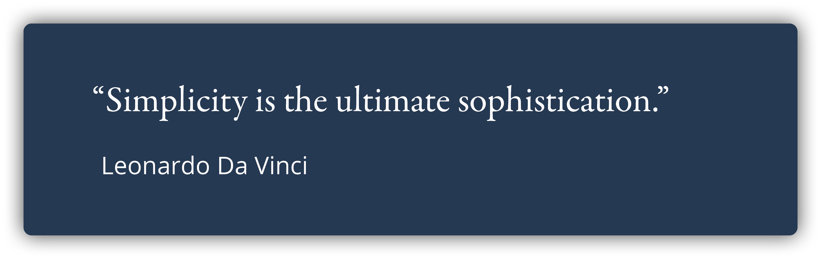
A designer knows he or she has achieved perfection, not when there is nothing left to add, but when there is nothing left to take away.
Nolan Haims